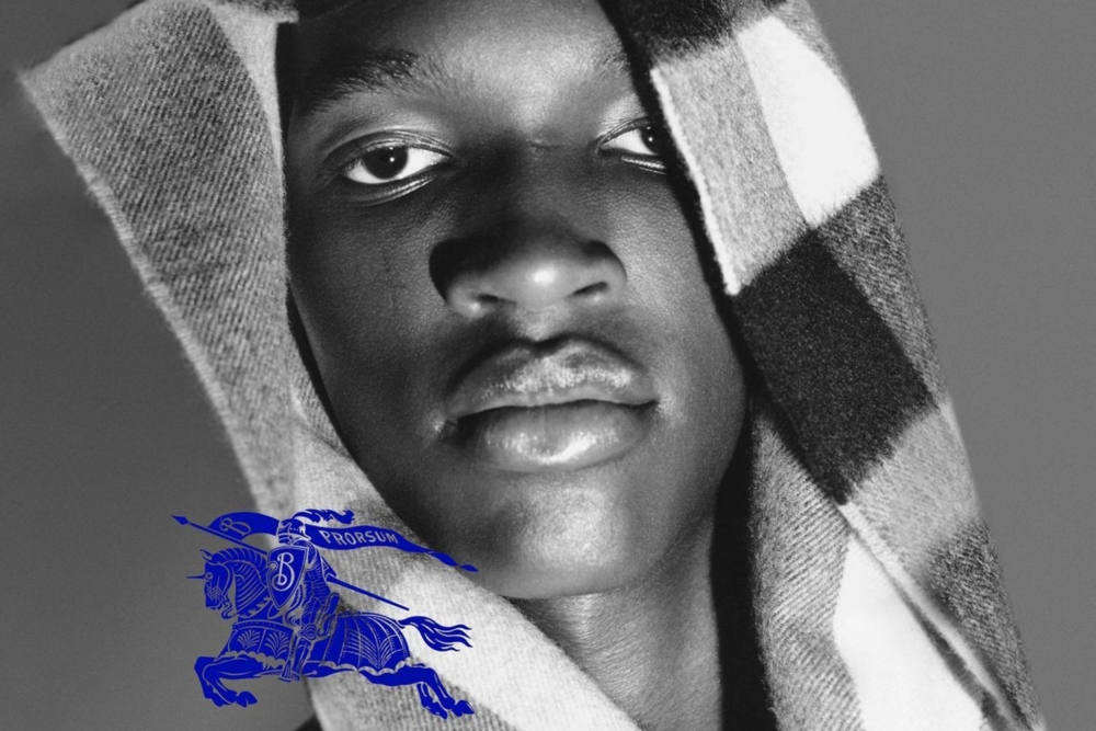
With an air of mystery and intrigue, the visionary behind Burberry’s rebrand, Daniel Lee, unveiled his first campaign as Chief Creative Officer; a triumphant tribute to the timeless elegance and quintessential Britishness that defines the legendary luxury brand. In a daring move, the Bradford-born designer wiped Burberry’s social media accounts clean, leaving fashion enthusiasts enraptured with anticipation of what was to come.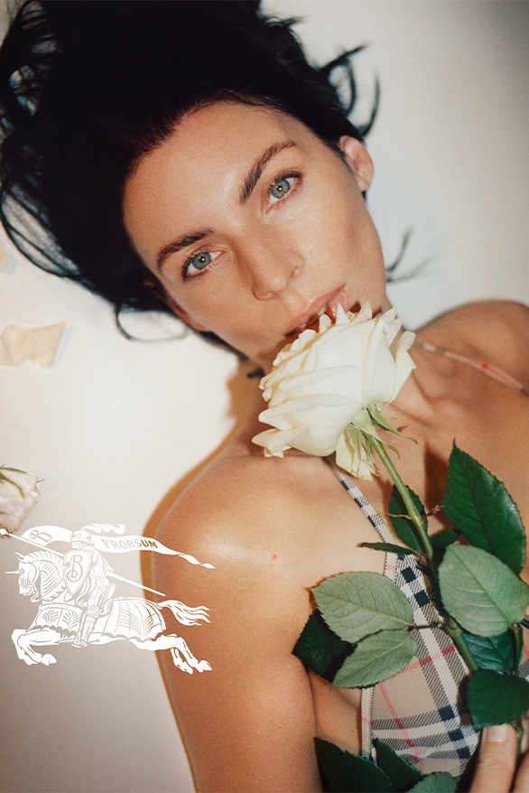
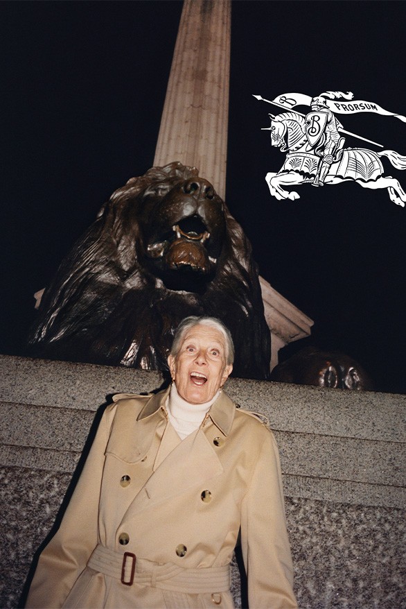
As the successor of Riccardo Tisci, who transformed Burberry over the course of four years with his signature streetwear aesthetic and bold branding, Lee is poised to bring a fresh perspective to the timeless label. Tisci’s unmistakable logo, known for its blocky lines, is no more, replaced by a whimsical revival of the classic Burberry emblem and the return of the revered equestrian ‘Prorsum’ logo, first created in 1901.
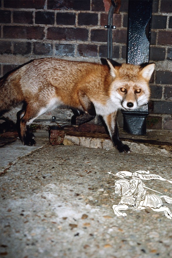
In a series of captivating campaign images shot by the talented Tyrone Lebone, we see Burberry’s new vision come to life in all its quirky, British glory. From legendary actress Vanessa Redgrave to football superstar Raheem Sterling, and even the beloved London rapper John Glacier, each shot was expertly crafted against the stunning backdrops of London’s most iconic landmarks, from Trafalgar Square to Albert Bridge. With its playful spirit, dreamy imagery, and irreverent nod to British heritage, Lee’s new direction for Burberry promises to bring a breath of fresh air to the world of high fashion.
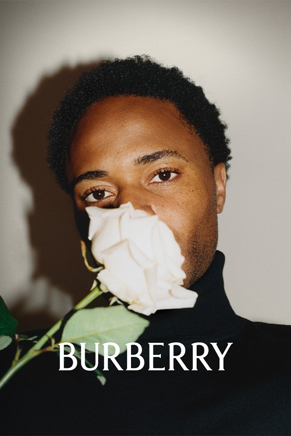
The rebrand, however, signals a shift. The distinctly classical motifs of the new Burberry rebrand with their emphasis on serif fonts, heritage graphics, and an air of eclectic sophistication and excess are in stark contrast to Tisci’s reductive and over-simplification of Burberry’s branding signatures.
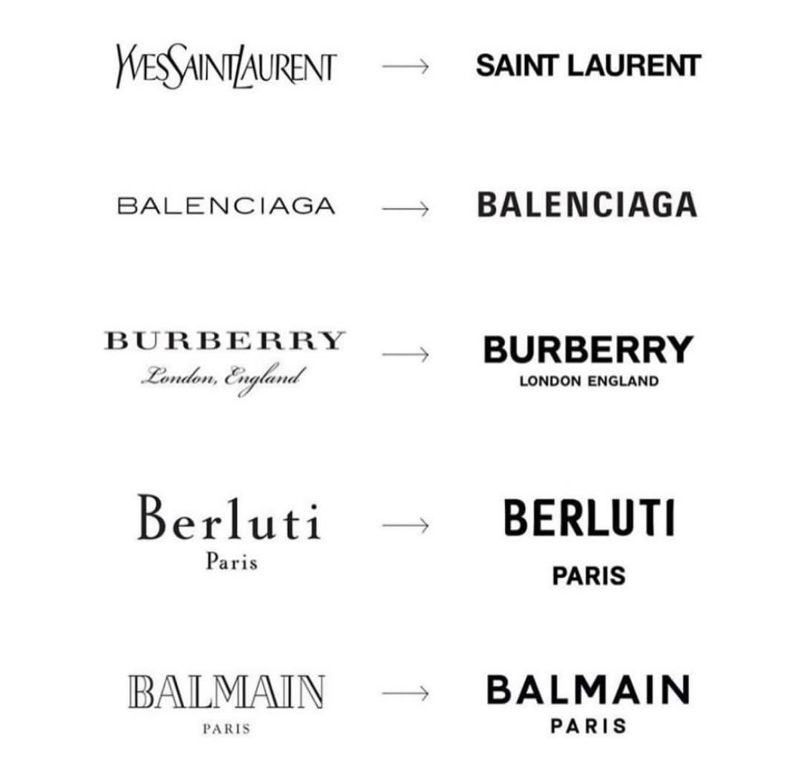
Is this the end of ‘Blanding’? For those out of the loop, Blanding refers to a certain phenomenon; the use of monochromatic or minimal design that defined the 2010s. With brand’s such as Balmain, Berluti, Balenciaga, and Burberry simplifying their logos with non-descript Arial-esque typographies, it seemed as though the aesthetics of luxury were, for better or worse, homogenizing. Now, however, fresh out of lockdown, consumers want the brands they choose to be bold and unique, as well as authentic and transparent.
The tell-tale, in addition to the return of serif, is the death of the logomania aesthetic that Tisci had attempted to inject into the brand. Lee has done away with Tisci’s monogram, which now in retrospect seems like a hamfisted attempt at appealing to Instagram audiences. Is this a lesson in staying true to the heritage and brand ethos in the age of accelerating micro-trends? Consumers certainly seem to be gravitating toward authenticity, as opposed to homogeneity. As for Lee’s debut collection for Burberry, time will tell if the rebrand succeeds in the sartorial department.

Cody is the Editor in Chief and senior contributor at liminul.
He is a photography aficionado, fashion enthusiast, avid Lana Del Rey fan, and lover of all things aesthetically pleasing.

