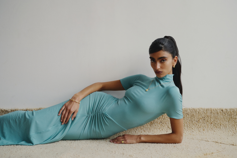
Jewellery often arrives already carrying meaning: a declaration, an inheritance, a marker of intimacy or status. At STUDIO RYBKO, meaning begins somewhere more elemental; with form. Rounded, tapered and almost disarmingly simple, the egg recurs as a motif throughout the Montréal fine-jewellery house’s first collections. Raphaël Ribkoff calls it GOOG, borrowing a slang term for the object. In his hands, however, it behaves somewhat like a distilled design philosophy.
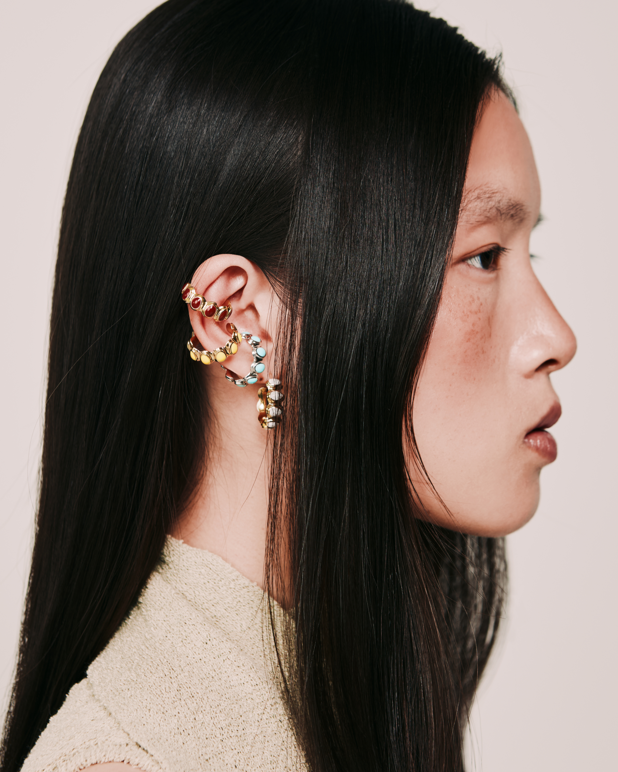
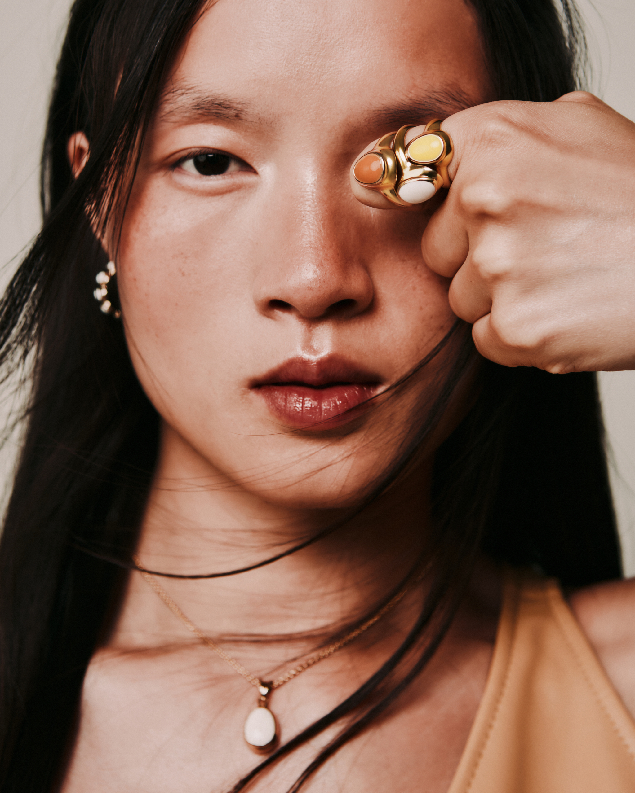
GOOG moves easily between a single form and a repeated one: linked into chains, stacked across fingers or enlarged and reduced from piece to piece. HUES, STUDIO RYBKO’s debut collection, introduced it in solid 14K gold and hand-mixed enamel, with a palette drawn from eggs found in nature: Robin blue, Emu deep green, Shell neutral. CORE removes the enamel and leaves the form exposed in yellow, white and rose gold, shifting attention toward its weight, volume and repetition.
For Ribkoff, this precision is foundational. The son of Canadian fashion designer Joseph Ribkoff, Raphael grew up with an intimate understanding of how a creative business is built, but chose to establish a language outside the conventions of ready-to-wear. After studying fashion marketing and design, jewellery workshops led him to formal training in Montréal and nearly a decade of experience across design and production.
That patience and emphasis on savoir-faire remains visible in the work. Ribkoff designs each piece in CAD, repeatedly 3D-printing forms to refine details by fractions of a millimetre. Prototypes are then produced in silver and tested for weight, comfort and function before moving into gold. Ribkoff works closely with a goldsmith and, for HUES, mixes and applies each layer of enamel himself. Design and production remain together inside the Montréal studio, allowing the object to evolve throughout the making process.
STUDIO RYBKO debuted in Toronto in December 2025 before presenting CORE at Montréal’s FOIL Gallery in July 2026. As a brand in its first stage of growth, the house is defining itself through a series of productive dualities: permanence and play, handwork and digital precision, fine jewellery and contemporary image-making.
LIMINUL spoke with STUDIO RYBKO founder and creative director Raphaël Ribkoff about departing from an inherited fashion legacy, discovering the egg as a generative form, designing between the screen and the hand, and building an internationally minded jewellery house from Montréal.
As the son of Canadian fashion designer Joseph Ribkoff, you entered design with an established creative legacy behind you but ultimately chose to build a fine-jewellery house of your own. What first drew you to jewellery design, and when did STUDIO RYBKO begin to take shape as a brand?
I grew up around fashion and design, so it was always a world I understood and was drawn to. I initially studied fashion marketing and design, but I felt the industry was quite saturated and wanted to explore something that felt more permanent and more focused on the object itself.
I started taking jewellery workshops, and one of my teachers told me about a jewellery school in Montréal. I decided to attend, and that was really where my interest developed into a passion. I became fascinated by the precision of jewellery and how much thought can go into something at such a small scale.
That was the beginning of what has now been close to a ten-year journey in jewellery. Over the years, I worked in different areas of the industry, particularly in design and production, which gave me a strong understanding of how a piece moves from an idea to something that can actually be made and worn.
The idea of STUDIO RYBKO had been with me for many years. I was waiting until I felt I had the experience, perspective and timing to bring it to life.
The egg is described as a recurring symbol in your creative world and now forms the basis of GOOG. Where did that fascination begin, and how did the name GOOG emerge?
Nature was the starting point. I knew I wanted the pieces to take inspiration from some of the most remarkable designs found in nature, and I began researching and developing different themes from there. The egg was one of them, and the deeper I went into it, the more it spoke to me.
I was drawn to the contrasts within it. It is simple yet complex, silent yet powerful, and pure as a form. As I researched further, I also became interested in the incredible variety of eggs found in nature, from their colours and markings to the birds they come from. It opened up a much broader world around what initially seemed like such a simple object.
During that research, I came across “goog” as a slang term for an egg. I loved the way it looked and sounded, and it gave the form its own identity within the world of STUDIO RYBKO.
What did you want STUDIO RYBKO to look and feel like from the beginning? Were there particular visual, artistic or architectural references that helped shape the brand’s identity?
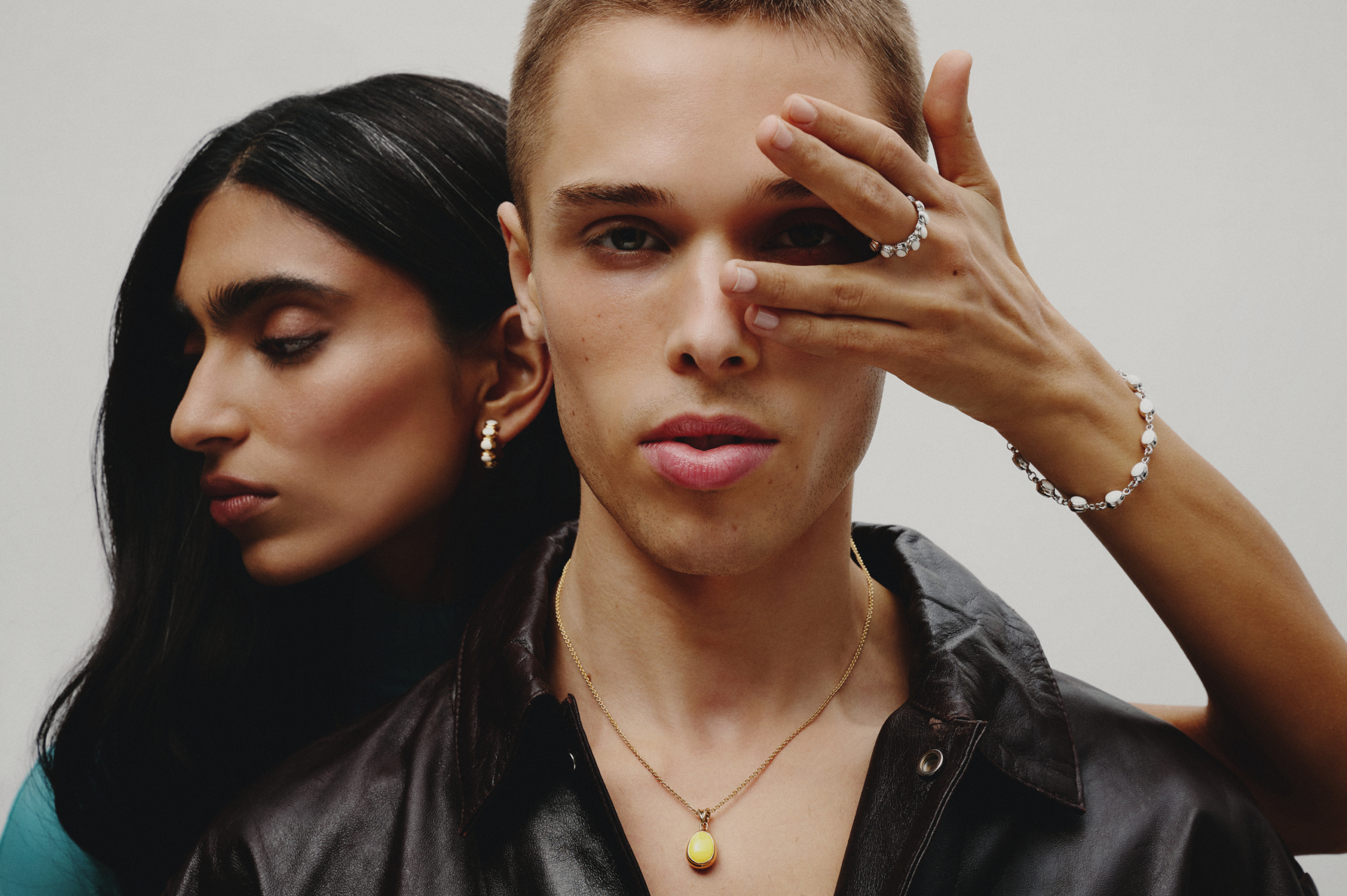
From the beginning, I wanted STUDIO RYBKO to feel playful but sophisticated. There is a duality to the brand that is very intentional. The jewellery has an heirloom quality and is made to last, but the way we design and present it is much more contemporary.
I pull references from many different places rather than one specific artist or movement. Nature is always present, but I am equally influenced by architecture, objects, fashion, vintage references and the design that surrounds us. I think STUDIO RYBKO naturally finds itself somewhere between fashion and design.
It was also important to create our own visual language rather than follow the more traditional codes of fine jewellery. I wanted to build a world that could be refined without feeling too serious, and where there is always room for something unexpected.
HUES introduced GOOG through solid 14K gold and six enamel colours: Robin, Bordeaux, Marigold, Emu, Yolk and Shell. How did you develop that palette, and what did colour bring to this first expression of GOOG?
The palette came directly from the research around eggs and the incredible range of colours found within them. Robin references the blue of a robin’s egg, Emu the deep green of an emu egg, and Shell the natural simplicity of the eggshell. Yolk and Marigold explore the yellows and deeper orange tones found in yolks, while Bordeaux comes from the reddish, earthy tones that can be found across different eggshells.
Enamel gave me a lot of control over that exploration. We hand-mix the enamel, which allows me to develop very specific colours, while the technique itself allows us to create the precise shapes I am looking for. I also really liked the contrast between the colour and the solid 14K gold.
Colour was important for HUES because I wanted the first expression of GOOG to feel playful and immediately establish its own identity. Fine jewellery can often follow a very familiar visual language, and colour gave us a way to approach it differently from the beginning.
CORE removes the enamel and presents GOOG in yellow, white and rose gold. What prompted that shift, and how does CORE develop the design language established through HUES?
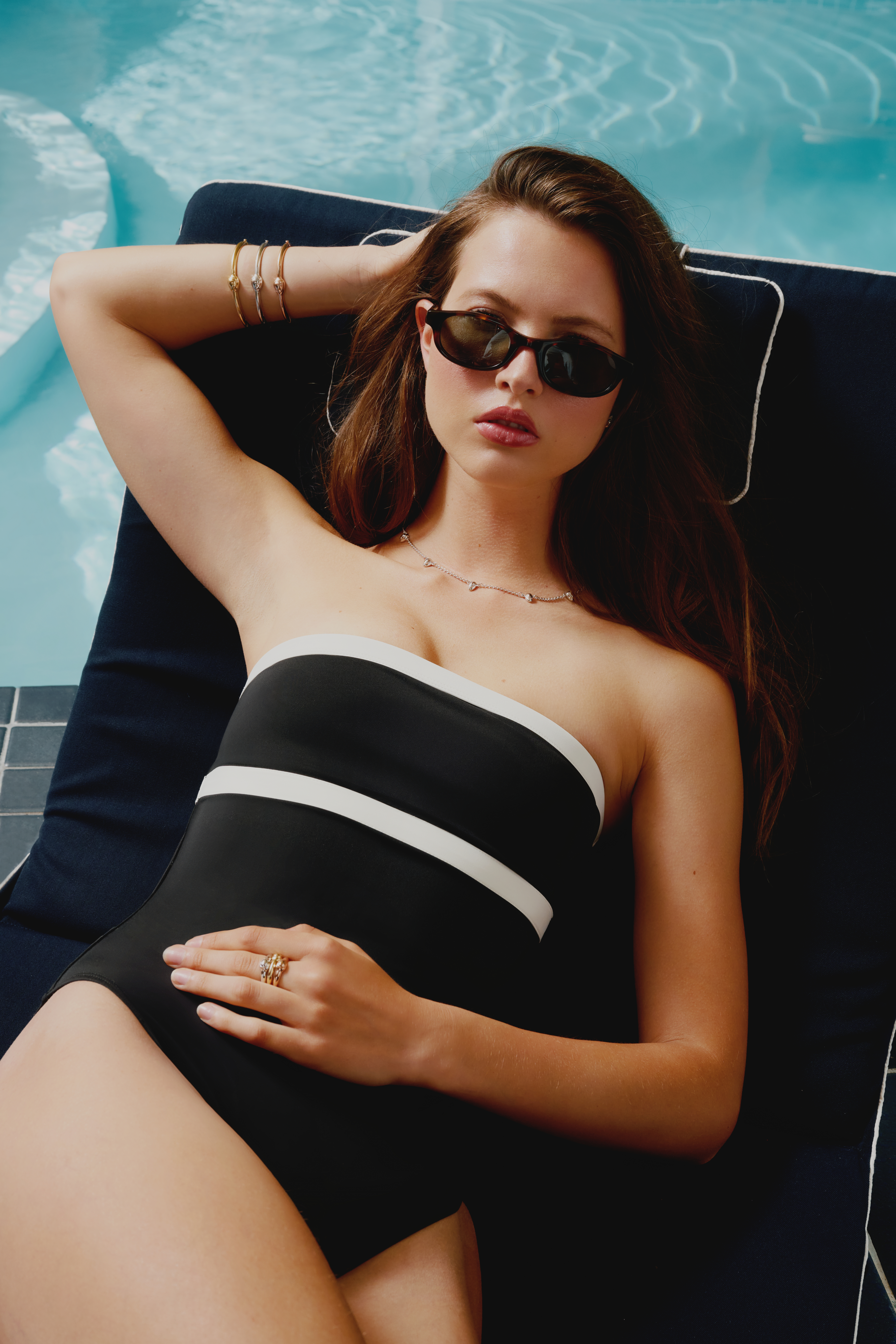
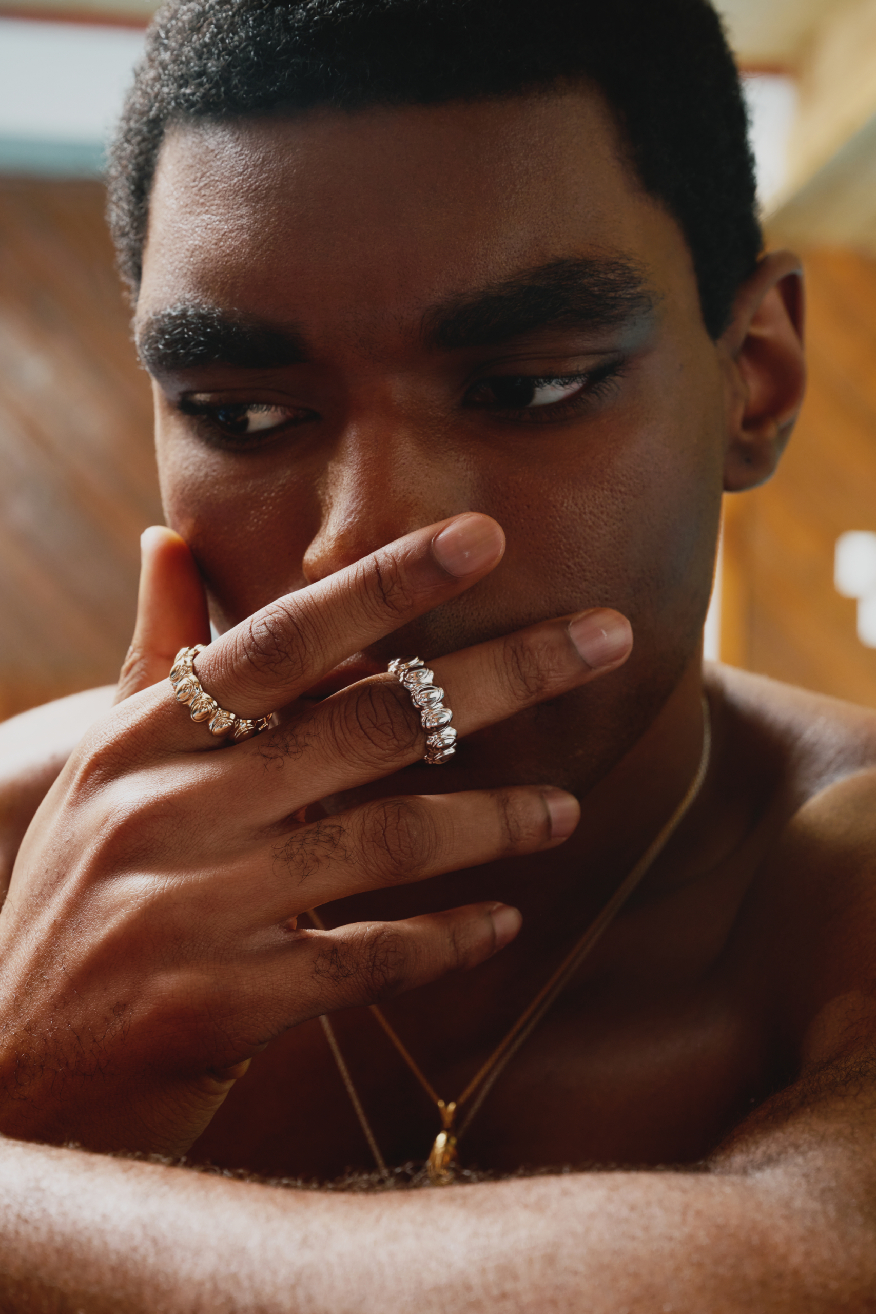
With CORE, I wanted to strip back the colour and explore GOOG in its pure metal expression. Without enamel, the focus shifts more directly to the shape, volume and proportions of the form, and how it can be repeated, stacked and worn.
It also allowed us to introduce more everyday pieces and explore layering in a different way. The STACK ring is a good example of that, where a simple repetition of the form creates something new depending on how it is worn and combined.
CORE was never intended to replace HUES. The two collections are designed to coexist and be worn together. HUES introduced GOOG through colour, while CORE brings the form back to its most essential expression in gold. Together, they represent two different sides of the same design language.
Across HUES and CORE, the GOOG form is presented individually, linked, stacked, repeated and altered in scale. How do you continue exploring one recognizable form without allowing it to become restrictive?
I see GOOG as a building block rather than a fixed motif. Even within one recognizable form, there are so many variables to explore: scale, proportion, repetition, orientation, material and the way the forms interact with one another. A small change can completely alter how a piece looks and feels when worn.
That is what keeps it from becoming restrictive for me. HUES and CORE have only explored certain sides of the form, and I still feel there is more to discover within it.
GOOG will always be a base motif and an important part of the identity of STUDIO RYBKO, but it was never meant to define the limits of the brand. Nature is much broader than one form, and over time I want to explore other themes with the same depth that we have given to the egg.
Your process moves between hand sketching, 3D modelling and collaboration with goldsmiths and artisans. Can you walk us through how a design progresses from its initial idea to a finished piece?
My process usually starts with research and moves quite quickly into 3D modelling. I personally do all of the CAD work, which has become a very natural way for me to design. I do sketch at times, but I often prefer to work directly in three dimensions because I can immediately start thinking about proportion, construction and how the piece will sit on the body.
From there, we always 3D print prototypes. I can make very small adjustments, sometimes by a fraction of a millimetre, print the piece again and continue refining it until the proportions feel right. Once we are happy with the printed prototype, we produce a sample in silver so we can wear-test the piece and evaluate its weight, comfort and functionality before moving into gold.
I work very closely with my goldsmith throughout that process, and we often go through multiple iterations before arriving at the final piece. For HUES, I also hand-mix the enamel colours and apply the enamel myself in layers.
Everything happens from start to finish in our Montréal studio, without outsourcing. Having the design and production under one roof means I can remain very involved at every stage and make adjustments throughout the process rather than treating design and making as two separate things.
STUDIO RYBKO’s pieces are made to order and finished in Montréal. How has establishing the brand and its production in the city influenced its development?
Montréal has a very particular mix of European and North American influences, and I think that naturally finds its way into STUDIO RYBKO. There is also a strong culture of art, architecture and design here that has always been part of my surroundings and continues to influence the broader world of the brand.
Producing locally was important to me from the beginning. It gives us control and proximity to every piece we make, while allowing us to work primarily on a made-to-order basis rather than producing large quantities of inventory.
Montréal is also home, and I like the idea of building STUDIO RYBKO here while looking outward. There is no reason a fine-jewellery house with international ambitions needs to come from one of the traditional fashion capitals, and I want to show that something distinctive can be built from Montréal and have a presence well beyond it.
How do you approach the campaign imagery and wider visual identity of STUDIO RYBKO, and who do you imagine wearing the jewellery?
Storytelling is a very important part of how I approach STUDIO RYBKO. I see each campaign as an opportunity to expand the world around a collection beyond the jewellery itself. There is often a mix of nostalgia and surrealism in the imagery, but I still want it to feel refined and contemporary. That contrast is very intentional.
I am closely involved in the creative direction, from the initial concept through to the set, styling and casting. For me, those decisions are part of the same process as designing the jewellery. They help give each collection its own atmosphere while continuing to build the larger visual identity of STUDIO RYBKO.
I don’t design with a specific age or gender in mind. I am much more interested in people who have a strong sense of individuality and an appreciation for design. The pieces are meant to become part of someone’s existing rotation, mixed with jewellery they already own and worn in their own way. I want to create the object, but leave space for the person wearing it to give it their own identity.
STUDIO RYBKO officially debuted in Toronto in December 2025 and presented CORE at FOIL Gallery in Montréal this July. What have you learned during that first period of growth, and where do you want to take the brand next?
One of the biggest things I have learned is how important it is for people to experience the jewellery in person. The pieces are very sculptural, and there is something about seeing their scale, weight and proportions on the body that is difficult to fully communicate through an image. Presenting the collections physically, from our debut in Toronto to CORE at FOIL Gallery, really reinforced that for me.
I have also learned the importance of being patient. Building a fine-jewellery brand takes time, and I would rather grow deliberately and make the right decisions than move quickly for the sake of growth. These first months have also allowed me to better understand who is connecting with STUDIO RYBKO, how they are wearing the pieces and what they respond to.
Looking ahead, I want to continue expanding the world of STUDIO RYBKO both creatively and geographically. That means continuing to explore new expressions of our design language, creating more physical experiences around the collections, and gradually introducing the brand to new markets beyond Canada. We are still very much at the beginning, and there is a lot more I want to explore.
Cody Rooney is the Editor in Chief and senior contributor at liminul.
He is a PhD candidate, digital content specialist, writer, editor, multi-media artist, and photographer.